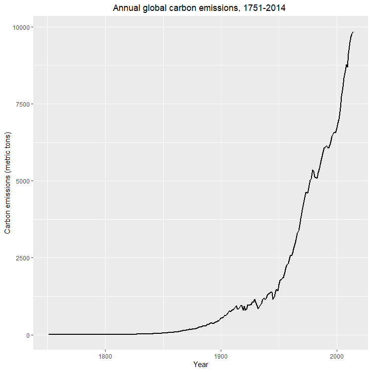
Emissions
You can also see the Carbon Emissions increase over the years.
This was programmed using R in R Studio
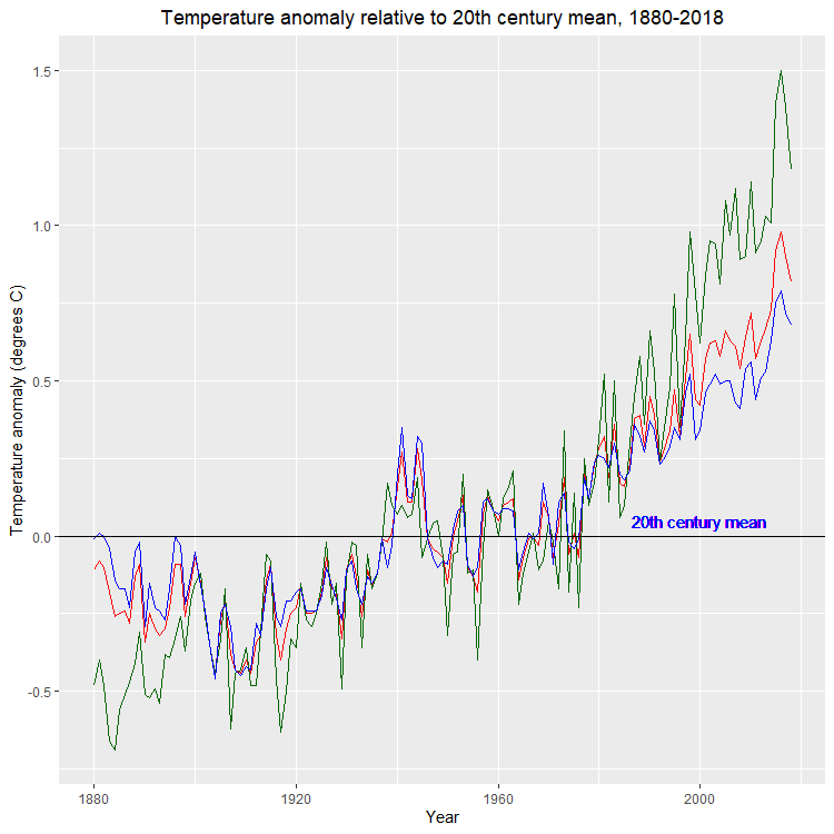
In the first plot, you can see as the years go on the global temperature increases.
This is where the name global warming comes from.
This is due to an increase in Carbon Dioxide from automobiles, ships, and other combustion engines.
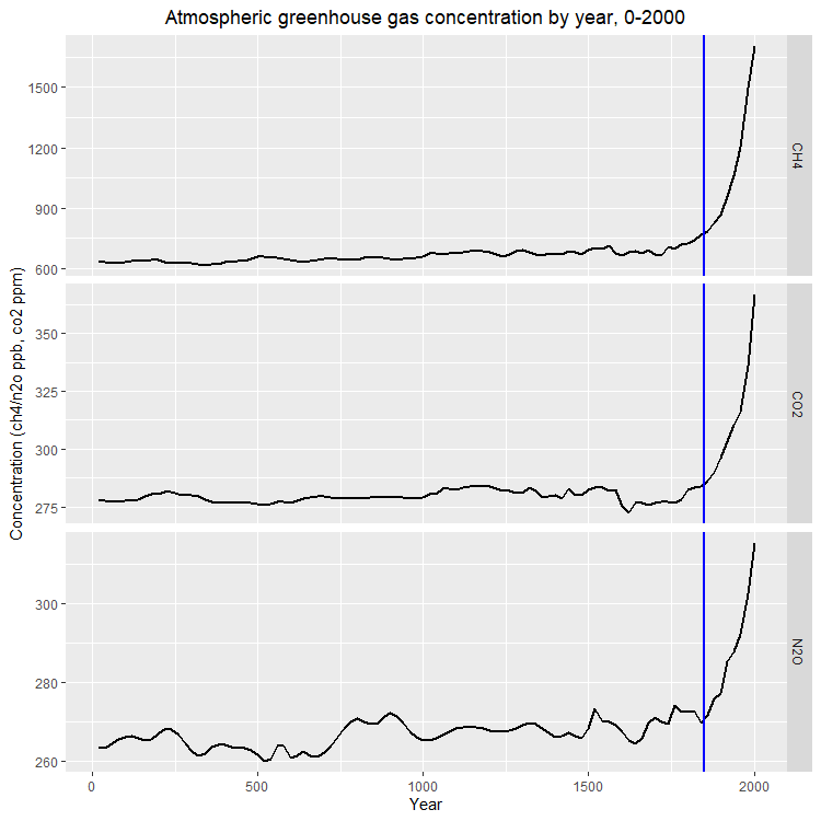
The second plot shows a rapid increase in greenhouse gas concentration from the blue line at year 1850.
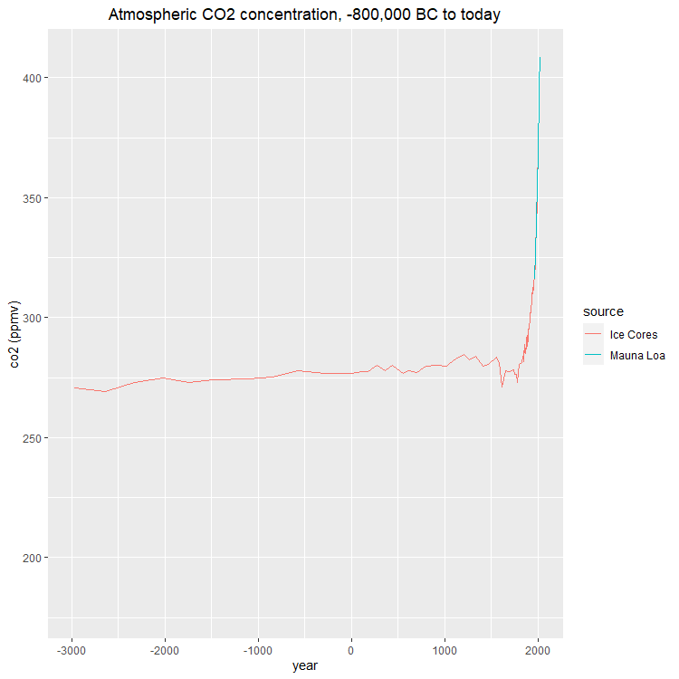
The third plot you can see from the year 1900 there has been a rapid increase in co2 emissions.
This clearly shows that as motor vehicles became more popular, co2 emissions increased.
To learn more on Carbon Dioxide Emissions click Here
Here is a preview of the Data
| Year | Gas | Concentration | |
|---|---|---|---|
| 1 | 20 | CO2 | 277.7 |
| 2 | 40 | CO2 | 277.8 |
| 3 | 60 | CO2 | 277.3 |
| 4 | 80 | CO2 | 277.3 |
| 5 | 100 | CO2 | 277.5 |
| Year | Co2 | Source | |
|---|---|---|---|
| 1 | 1959 | 315.97 | Mauna Loa |
| 2 | 1960 | 316.91 | Mauna Loa |
| 3 | 1961 | 317.64 | Mauna Loa |
| 4 | 1962 | 318.45 | Mauna Loa |
| 5 | 1963 | 318.99 | Mauna Loa |
| Year | Temp_anomaly | Land_anomaly | Ocean_anomaly | Carbon_emissions | |
|---|---|---|---|---|---|
| 1 | 1880 | -0.11 | -0.48 | -0.01 | 236 |
| 2 | 1881 | -0.08 | -0.4 | 0.01 | 243 |
| 3 | 1882 | -0.1 | -0.48 | 0 | 256 |
| 4 | 1883 | -0.18 | -0.66 | -0.04 | 272 |
| 5 | 1884 | -0.26 | -0.69 | -0.14 | 275 |
View the full greenhouse_gases dataset
Here
View the full temp_carbon dataset
Here
View the full historic_co2 dataset
Here
Download the full greenhouse_gases dataset
Here
Download the full temp_carbon dataset
Here
Download the full historic_co2 dataset
Here
                    library(tidyverse)

                    library(dslabs)

                    data(temp_carbon)

                    data(greenhouse_gases)

                    data(historic_co2)

                    temp_carbon %>%


                    filter(!is.na(temp_anomaly)) %>%


                    ggplot() +

                    geom_line(aes(year, temp_anomaly), color = "red", linewidth = .7) +

                    geom_line(aes(year, land_anomaly), color = "darkgreen", linewidth = .7) +

                    geom_line(aes(year, ocean_anomaly), color = "blue", linewidth = .7) +

                    geom_hline(aes(yintercept = 0), col = "black") +

                    ylab("Temperature anomaly (degrees C)") +

                    xlab("Year") +

                    geom_text(aes(x = 2000, y = 0.05, label = "20th century mean"),
                    col = "blue") +

                    xlim(c(1880, 2018)) +

                    ggtitle("Temperature anomaly relative to 20th century mean, 1880-2018") +

                    theme(plot.title = element_text(hjust = .5))


                    greenhouse_gases %>%

                    ggplot(aes(year, concentration)) +

                    geom_line(linewidth = 1) +

                    facet_grid(gas~., scales = "free") +

                    geom_vline(xintercept = 1850, color = "blue", linewidth = 1) +

                    xlab("Year") +

                    ylab("Concentration (ch4/n2o ppb, co2 ppm)") +

                    ggtitle("Atmospheric greenhouse gas concentration by year, 0-2000") +

                    theme(plot.title = element_text(hjust = .5))


                    temp_carbon %>%

                    filter(!is.na(carbon_emissions)) %>%

                    ggplot(aes(year, carbon_emissions)) +

                    geom_line(linewidth = 1) +

                    ylab("Carbon emissions (metric tons)") +

                    xlab("Year") +

                    ggtitle("Annual global carbon emissions, 1751-2014 ") +

                    theme(plot.title = element_text(hjust = .5))


                    co2_time <- historic_co2 %>%

                        ggplot(aes(year, co2, col = source)) +

                        geom_line() +

                        ggtitle("Atmospheric CO2 concentration, -800,000 BC to today") +

                        ylab("co2 (ppmv)") +

                        theme(plot.title = element_text(hjust = .5))

                        co2_time


                        co2_time +

                        xlim(-3000, 2018)
Visuals