Murders
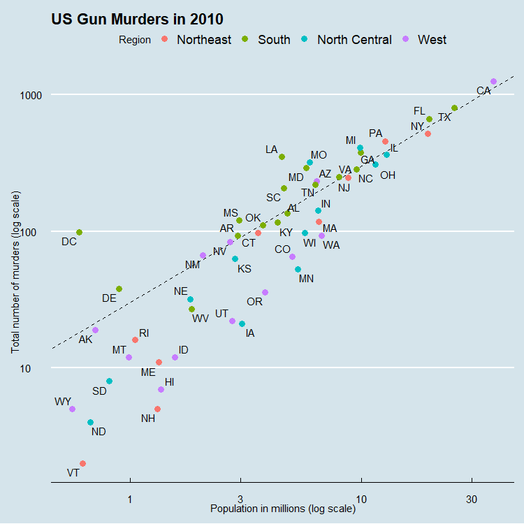
In this project you can see the total number of murders based on state
and population in the year 2010.
This was programmed using R in R Studio
On the X-axis is Population and on the Y-axis is the Total Number of
Murders
The legend color codes the states by region.
You can see that California has the most murders, however it has the
highest population as well.
Some of the safest places would be Vermont, North Dakota, or even New
Hampshire.
Overall the safe states are below the dashed line which dictates the
average amount of murders based on the population
To learn more on murder statistics click
Here
Here is a preview of the Data
| State | Abb | Region | Population | Total | |
|---|---|---|---|---|---|
| 1 | Alabama | AL | South | 4779736 | 135 |
| 2 | Alaska | AK | West | 710231 | 19 |
| 3 | Arizona | AZ | West | 6392017 | 232 |
| 4 | Arkansas | AR | South | 2915918 | 93 |
| 5 | California | CA | West | 37253956 | 1257 |
| 6 | Colorado | CO | West | 5029196 | 65 |
| 7 | Connecticut | CT | Northeast | 3574097 | 97 |
| 8 | Delaware | DE | South | 897934 | 38 |
| 9 | District of Columbia | DC | South | 601723 | 99 |
| 10 | Florida | FL | South | 19687653 | 669 |
View the full dataset Here
Download the full dataset
Here
          library(tidyverse)

          library(ggrepel)

          library(ggthemes)

          library(dslabs)

          data(murders)


          r <- murders %>%

          summarize(rate = sum(total) / sum(population) * 10^6) %>%

          .$rate


          murders %>%

          ggplot(aes(population/10^6, total, label = abb)) +

          geom_abline(intercept = log10(r), lty = 2, color = "black") +

          geom_point(aes(col = region), size = 3) +

          geom_text_repel() +

          scale_x_log10() +

          scale_y_log10() +

          xlab("Population in millions (log scale)") +

          ylab("Total number of murders (log scale)") +

          ggtitle("US Gun Murders in 2010") +

          scale_color_discrete(name = "Region") +

          theme_economist()
Visuals